SQL to Python Analytics Pipeline
- Problem
- How did two spellings of one name, Marc and Mark, change in U.S. male births, and can the analysis stand on public data alone?
- My role
- Sole author. SQL Server extraction in Python, then the public pandas pipeline and the write-up.
- Question
- How have two spellings of one name, Marc and Mark, changed in U.S. male births since 1880?
- Data
- U.S. Social Security baby names, 1880 to 2025. Source: Social Security Administration public data. License: Public U.S. government data; see the repository README.
- Result
- A public, database-free pipeline reproduces the full analysis and chart from a fresh download; the original SQL Server path is kept as optional evidence.
Question
How did the popularity of two spellings of the same name, Marc and Mark, change over time in U.S. male births? A second question shaped the project: could the analysis, which began against a course database, be rebuilt so anyone can reproduce it from the original public source?
Data
The Social Security Administration’s national baby-name totals, public domain: one file per year,
Name,Sex,Count with no header. The public notebook loads 146 yearly files covering 1880 to 2025,
2,181,032 rows in total (notebook output), derives each year from its filename, and keeps 263 rows
after filtering to male births named Marc or Mark. The download script fetches the official archive,
validates it, extracts the files, and writes a provenance record (source URL, retrieval time,
SHA-256, year range). One data-quality fact drives the reading: SSA omits any name with fewer than
five occurrences in a year, so Marc has no entry before 1901; the early gap is a reporting floor,
not a true zero. Sources: README, data/README.md, notebook outputs.
SQL and schema
The project began as a database exercise against a SQL Server table named all_data with the
columns Name, Gender, Year, and NameCount. The query the notebook issues from Python:
SELECT Name, Gender, Year, NameCount
FROM all_data
WHERE (Name = 'Marc' OR Name = 'Mark')
  AND Gender = 'M'
ORDER BY Year
The connection is built with pyodbc from environment variables (DB_SERVER, DB_NAME, DB_USER,
DB_PASSWORD, and an overridable DB_DRIVER defaulting to ODBC Driver 18 for SQL Server), so no
credential is ever in the notebook. That notebook, sql-to-python-pipeline.ipynb, is preserved as
annotated code and carries no saved outputs, because the course database requires student
credentials and is not publicly reachable. Source: the notebook and README.
Method
The public path, adapted from the README’s pipeline diagram and workflow steps:
SSA public data files
  -> Python / pandas    load 146 yearly files, add year from filename
  -> filter + reshape   male births, two names, long to wide pivot
  -> analysis           peaks, ratios, correlation, missing-value check
  -> matplotlib         time-series comparison
  -> interpretation     what the data supports, and what it does not
Acquire, load, filter, reshape, verify, analyze, visualize, interpret. The verification step asks why values are missing before treating them as zero, which is where the reporting floor was identified. Correlation between the two series is reported in rank terms as well as linear terms.
Result
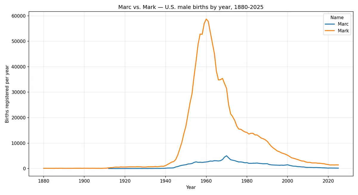
Mark peaked in 1960 at 58,727 births; Marc peaked in 1970 at 5,009. Both spellings follow the same broad arc: negligible before the 1940s, a sharp mid-century rise, a peak, then a long decline that continues through 2025 (Mark 1,416 and Marc 162 in 2025). The correlation uses the 117 years where both names have reported values: the calendar span is 1901 to 2025, but eight years inside it have no Marc row because SSA suppresses name counts below five (notebook output: 29 missing Marc years in 146, none for Mark). Across those 117 years the series track each other closely in rank (Spearman 0.97; Pearson 0.80), with two qualifications: the peaks are ten years apart, and the volume gap is not constant (Marc reaches about 8.5 percent of Mark’s height at their respective peaks, while the year-by-year ratio ranges from under 2 percent to about 28 percent, median 12 percent). The cautious reading in the README: the two spellings rose and fell over broadly the same era, with Marc consistently far less common and its trajectory shifted about a decade later. Two series that both rise and fall mid-century will correlate partly because they share an era; the data shows the pattern, not its cause. Counts come from Social Security card applications, not a complete birth registry. Sources: README key-finding table and limitations, notebook outputs.
Notebook
notebooks/public-ssa-analysis.ipynb is committed executed with outputs, so the results read on
GitHub without running anything; notebooks/sql-to-python-pipeline.ipynb is the original database
path, annotated and unexecuted for the reason above. Rendering the executed notebook inside this
page through Quarto is an open item of the site build (the tool is not yet installed on the build
machine). What went wrong along the way is in docs/process-notes.md: JupyterLab would not launch
on Windows because of a redirect-file bug, and native package builds failed until Visual Studio
Build Tools were installed; both fixes are written down.
Repository
github.com/KhaylubThompsonCalvin/sql-python-analytics-pipeline:
both notebooks, scripts/download_ssa_data.py (with a manual-archive fallback for networks that
the SSA CDN blocks), the data README, the chart, and the process notes. It contains only my own
work and analysis of public data; no course materials or grades. The project grew out of CIS277A
Data Analytics at Portland Community College and was extended so the analysis stands on data anyone
can download.
Credits and process
- Source
- Chart names-trend-chart.png generated by the public notebook in the author's repository sql-python-analytics-pipeline, resized to 1200 px
- License
- The author's own notebook output; SSA data is public U.S. government data
- Date